
Typesetting on the web
Let’s be honest – setting typography on the web has always been clunky. CSS properties are relatively crude alongside the precise control and ease of use that applications like Photoshop and InDesign offer.
While developers have risen to the challenge, approaches to tooling have varied significantly. There has been little confidence or consensus amongst the community towards a tool that brings developers a similar level of control or transferability from design into development.
Problems with web typography arise primarily because of the zany way text is rendered on the web. The most frustrating feature of web typography is perhaps the inexplicable disparity between the way typographers have measured leading for hundreds of years – from one baseline to the next – and the way the modern web spec evolved in just the last two decades. This gave us the bizarre ‘spooky box’, formed by an unholy mating of CSS font-size and line-height.
Unfortunately, apart from a lacklustre vertical-align property, there is little concept of the typographic baseline in the browser.
Without a defined baseline on our type, we’re already a step away from defining any kind of meaningful grid on which to set our type. A recent post by Robin Rendle asked web designers and developers to consider a new standard for web typography. Well, it’s about time, I’d say. So let’s get to it.
We've created a typographic tool for the web that we like to call MegaType . We'll explain how we got there, and give you a short introduction to its use.
Why grids, why?
The use of grids is not an invention of the web. Geometric grids have been utilised by designers for centuries to provide structure and harmony to layouts. At its most fundamental level, grids serve to aid the user in the act of reading. It’s easy for the eye to traverse a document with a strong implied grid and rhythm.
Nowadays, it is commonly said that ‘ the web is 95% typography ’. Therefore, it follows that our grids should hold as much importance on the web as they ever have.
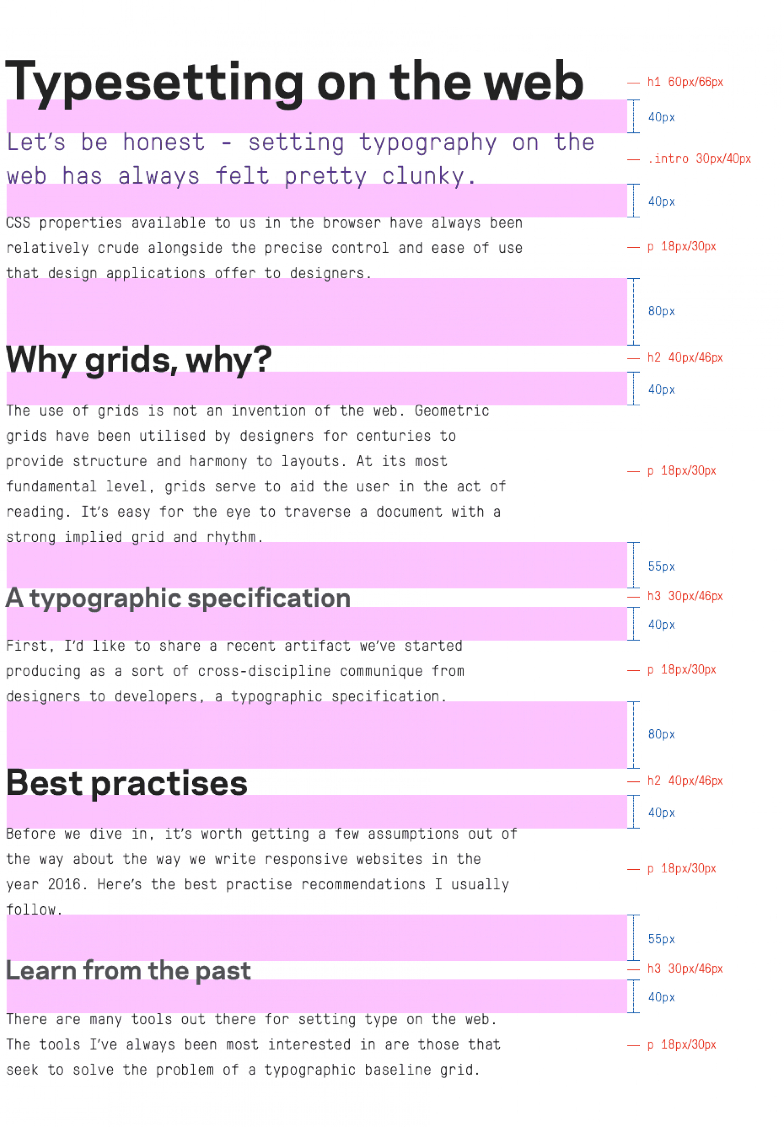
A typographic specification
Here's a recent artefact we’ve started producing as a cross-discipline communique from designers to developers; a typographic specification.
This is a precise descriptor of the structure of typography, spanning a range of responsive breakpoints on a site. It has become a very useful document at the early stages of development. It gives developers a clear starting point when setting typographic defaults, which if unscoped (a contentious practise itself, but that’s another story), lays the foundation of a website. As you can see, the aforementioned spooky box is absent in this spec – it just isn’t a useful or conceivable dimension in design and thus only serves as a blocker when we reach development.
We’ve come to consider that it could be useful if our tooling would eliminate this disparity, effectively allowing us to lay out type in the same language as our designers.
Best practises
Before we dive in, it’s worth getting a few assumptions out of the way about how we write responsive websites in 2016. Here’s the recommendations we usually follow.
- Type should be set in relative units (ems or rems). We build responsive sites and can benefit from the ability to scale layout based on parents or root-sizes if desired.
- Pixels? Never. Reserve them for things that should be measured exactly, eg; a 1px hairline.
- It is technically most correct to set line-height with unitless numbers. This makes the inheritance of this value more predictable.
- Even when leaning on a tool, the resulting output CSS should be as predictable as possible. Long story short - we prefer to avoid strange, unconventional implementations where possible.
- When using a tool, it would be useful to have at least one spacing property to fall back on that isn't already used without destroying our grid in unpredictable ways.
Handling spacing
When designing our system, the most important step is to choose a regime for spacing and stick to it. So what considerations do we need to keep in mind?
Back in 2011, Harry Roberts introduced the concept of a Magic Number that dictated much of our type decisions throughout the web. These days, a similar effect can be achieved with much less effort by relying on rem units for typography and any layout elements that should scale alongside it. Many of the type systems that follow represent an evolution of this technique.
In another post by Harry Roberts, he suggests we eliminate the concern over collapsing margins - it’s just one less thing to worry about. This seems especially sensible when we consider that the elimination of the spooky box could likely rely on the use of negative margins, which tend to collapse in a very unintuitive manner.
One further possibility is the use of relative positioning to shift our type to sit on a baseline. As this doesn't affect the layout of other elements (which is, potentially, quite an attractive quirk), we will have to remember to factor this in when calculating the rest of our spacing.
A useful debugging mechanism is something else to keep in mind – we want to be able to visualise our spacing and baseline grid when we’re developing. And if our goal is to eliminate the spooky box, it could be nice to visualise the ‘virtual’ boxes we’re creating when we use these mixins.
Learn from the past
There are many tools out there for setting type on the web. The tools I’ve always been most interested in are those that seek to solve the problem of a typographic baseline grid.
For many years soon after the advent of CSS preprocessors, Compass was probably the most widely used tool for solving the needs of vendor prefixing. It’s also largely responsible for cementing the term ‘Vertical Rhythm’ in the minds of most web developers.
Nowadays, with the prevalence of shiny tools like postcss , it’s easy to forget that, at the time, this was a pretty handy library, and many developers first cut their teeth on baseline grids using its vertical rhythm mixins. A simple implementation might look like so:
$base-font-size: 16px; // this is the grid leading@include establish-baseline; // initialise the gridh1 { @include adjust-font-size-to(20px, 2); // 20px font-size with line-height at 2 units of baseline @include leader(1); // one line of space above @include trailer(2); // one line of space below}That’s about all the config you’d need to get started. The beauty of this system was that it required barely any config to get up and running, and the mixins all produced very predictable output.
Type would flow down the page in an orderly fashion to a grid, but floated vertically in the middle of the baseline units specified - instead of sitting neatly on the baseline itself. Therefore, problems arose if you wanted to set type in columns adjacent to each other as their baselines would not line up. Thus, the simplicity of this system would ultimately lead to its downfall in the eyes of many typography geeks.
Computing cap height
More recently, Jake Giltsoff (from Typekit) released an innovative approach called Sassline . Digging into the config for this tool, there’s a SASS map for each typeface that stores a bunch of typographic information. One key in particular caught my eye:
// variables.scss// Add typefaces here.// Add weight and style details too.// Set cap height to set to the baseline.$bodytype: ( font-family: 'Georgia, serif', regular: 400, bold: 700, italic: italic, cap-height: 0.66 ) !default;$headingtype: ( font-family: 'Helvetica, sans-serif', regular: 400, bold: 700, cap-height: 0.66 ) !default;// Here are some local fonts cap-height sizes to get you started:// Georgia: 0.66, Times / Times New Roman: 0.65, Palatino: 0.52// Lucida Grande: 0.72, Helvetica: 0.66, Verdana: 0.76, Tahoma: 0.76
Enter cap-height; the missing piece of the puzzle that lets us abolish the ‘spooky box’ once and for all. This excellent blog post by Razvan Onofrei delves deeper into the subject, and appears to be the inspiration for this feature in Sassline.
Utilising this concept, the calculation to give us the height of our spooky-boxless type is pretty simple:
cap-height * computed line-height
In Sassline, this is utilised by another mixin, which for those more familiar with the predictable and modular mixins of Compass might seem a little overbearing:
p { @include sassline($fontsize, $font, $lineheight: 2, $below: 2, $breakpoint: 0);}This allows us to set type perfectly on the baseline by telling the mixin what typeface you are using so that it can intelligently generate offsets based on its stored cap-height. Amazing!
But now we have this cluster of properties to define. Do we really need all of them? Let’s break it down.
Setting font-size, line-height, and general spacing with a $below parameter (and/or an $above parameter) are central to our goal. We need the information about the cap-height for calculating our baseline, so some kind of parameter must exist to tell our mixin about this, so $font stays. However, it seems unintuitive to declare the breakpoint we’re setting as a parameter. With other properties, we would normally set the breakpoint by wrapping them in a media query or some kind of breakpoint helper mixin.
Sassline does it this way because it needs to know a number of config values for the target breakpoint, but instead we can gain this value by accessing a contextual variable inside a custom mixin. Assuming we have a config to store some breakpoint information, and some supporting mixins and functions to retrieve it, let’s give this a go:
$current-breakpoint: 0 !default;@mixin min-width($breakpoint) { $current-breakpoint: $breakpoint; @media screen and (min-width: get-breakpoint-width($breakpoint)) { @content; } $current-breakpoint: 0;}This lets us write a type config alongside a breakpoint config so that our mixins will always have access to their breakpoint context. With this setup, there’s no longer any reason for us to use a $breakpoint parameter.
One interesting aspect of Siegmeyer 2 took inspiration from a recent demo by Mike Riethmuller, implemented as an optional setting, aptly named type-scaling. This uses viewport units and calc() to scale the root font size – and thus, the entire baseline grid – smoothly between values set at different breakpoints.
A lot of thought was given to building modular code that would operate similarly to the Compass leader and trailer mixins. Unfortunately, this falls apart, as we need to know the cap-height, font-size and line-height in order to make any meaningful spacing calculations on an element.
We're also aware of the fact that Siegmeyer 2 was built as a boilerplate rather than a modular component. This makes it difficult to benefit from features or bug fixes if they’re added later down the track, and exposes a lot of complexity and clutter that we don’t necessarily want developers to worry about.

First steps
A few years ago, I made my first attempt at solving the problem of the spooky box.
Inspired by the setup behind Sassline, and leveraging the responsive layout tools provided by Susy 2 , I put together something that gives us a way to work where the spooky box doesn’t factor into our development. I called this Siegmeyer 2 :
I'm not going to delve too deep into the config for this , but, similar to Sassline, Siegmeyer 2 had a fairly heavy config. For setting type we had a very Sassliney looking mixin;
p { @include type($font: $display-type, $fontsize: 1rem, $lineheight: 2, $leader: 0, $trailer: 1); @include breakpoint(break-1) { @include type($display-type, $fontsize: 1.25rem, $lineheight: 2, $leader: 0, $trailer: 2); }}This would apply the font-size, the line-height, and compensate for the spooky box using a combination of padding and margin. And then controversially apply top and bottom spacing using borders.
After a few projects, I began to think that perhaps we could do even better.

Prototyping MegaType
I'd like to introduce MegaType , which - we believe - solves these problems.
Rather than building a boilerplate, I’ve wrapped this up as a modular component that can be included as needed. The advantage of this is that it reduces complexity for developers, cleans up our codebase, and allows everyone to benefit from bug fixes and updates.
You may have noticed that the typographic specification above does not have a baseline grid. That’s because I’ve observed that our designers, as often than not, choose to use a looser grid for type to provide increased flexibility.
But even without a formal baseline grid, it’s helpful to speak the same language as our designers. I wasn’t about to let the spooky box back into our workflow without a fight.
View the demo page at full size.
Let's take a look at how to set this up. We can install with npm or bower:
npm install megatype --save-dev
or
bower install megatype --save-dev
We’ll then import this into our SCSS:
@import megatype;
Before we output any styles, let’s have a look at the config. Here we’ll set up our rootsizes, responsive breakpoint settings, and grid gutters. We’ll also specify whether we want to snap our spooky-boxless type to the baseline grid or not. As an extra optional enhancement, I’ve kept an option for smooth, responsive type scaling.
// config.scss// enable responsive baseline & type scaling.// increases root font size from each breakpoint, starting from the min size specified in the rootsizes below$baseline-scaling: false !default;// enable formal baseline grid// snaps all type to the baseline grid$baseline-snap: true !default;// map for flexible retrieval of breakpoint info$breakpoint-map: ( 0: ( start: 0px, max: 420px, rootsize: 12px ), 1: ( start: 480px, max: 560px, rootsize: 14px ), 2: ( start: 768px, max: 840px, rootsize: 16px ), 3: ( start: 980px, max: 1080px, rootsize: 18px ), 4: ( start: 1280px, max: 1440px, rootsize: 20px )) !default;
Add as few or as many breakpoints as you’d like.
We also need to store information about our cap-height:
$sans: ( font-family: '"Helvetica Neue", Arial, sans-serif', regular: normal, bold: bold, cap-height: 0.71) !default;$serif: ( font-family: 'Georgia, serif', regular: normal, bold: bold, cap-height: 0.69) !default;
Next we will initialise our rootsizes by including the megatype mixin at the start of our code, and our breakpoint containers by calling set-container on whichever elements we want contained by our max-widths.
@include megatype;.container { @include set-container;}With these set up, we can start setting our type.
p { // we can set our type using pixels @include typeset($font: $sans, $fontsize: 16px, $lineheight: 24px, $leader: 0, $trailer: 16px); @include min-width(1) { // or we can use rems @include typeset($sans, 1.25rem, 2rem, 0, 1rem); } // we can set several breakpoints at once @include min-width(2 3) { // or we can use baseline units @include typeset($sans, 1, 2, 0, 1); } @include min-width(4) { // or we can use any combination @include typeset($sans, 16px, 2, 1, 1rem); }}This outputs our font-size in rems, our line-height as a unitless number, and our trailer as a margin, also in rems. The leader, however, is computed together with the offset we need to get rid of our spooky box, and results in a css top value, in rems. This is then added to our bottom margin to ensure any following items will flow correctly below - meaning that we’ve only got margins specified in one direction, and still have padding to fall back on if we want to further modify our flow down the page. Here’s what this looks like:
p { font-size: 1.33333333rem; // 16px = 1.33 * 12px rootsize line-height: 1.5; // 24px = 1.5 * 16px top: -0.47333333rem; // shifted up so baseline sits on grid margin-bottom: 0; // rounds to zero; no margin needed}@media (min-width: 30em) { p { font-size: 1.25rem; // 1.25rem line-height: 1.6; // 2rem is 1.6 * 1.25rem top: -0.44375rem; // shifted up so baseline sits on grid margin-bottom: 0; // rounds to zero; no margin needed }}@media (min-width: 48em) { p { font-size: 1rem; // 1 baseline unit = 1rem line-height: 2; // 2 baseline units with 1rem font-size = 2 top: -0.355rem; // shifted up so baseline sits on grid margin-bottom: 0; // rounds to zero; no margin needed }}@media (min-width: 61.25em) { p { font-size: 1rem; // 1 baseline unit = 1rem line-height: 2; // 2 baseline units with 1rem font-size = 2 top: -0.355rem; // shifted up so baseline sits on grid margin-bottom: 0; // rounds to zero; no margin needed }}@media (min-width: 80em) { p { font-size: 0.8rem; // 16px = 0.8 * 20px rootsize line-height: 2.5; // 2 baseline units (2rem) = 2.5 * 0.8rem font-size top: 0.716rem; // shifted down so baseline sits on grid margin-bottom: 1rem; // 1rem below }}We’ve been successful in using this setup – being able to set our type while accounting for cap-height and baseline has made implementing beautiful, readable typography a breeze.
This is just an introduction; head on over to the MegaType Github page for more.
Gazing beyond
All of this takes us back to the initial question: why doesn’t the web have a concept of the true baseline? Could there be room in the CSS spec for further expansion to the suite of typographic properties available to us? Perhaps including a cap-height property, or other typographic information such as baseline and x-height, for example?
There's definitely room to grow in this space. We’d love to hear your own adventures in web typesetting, so let us know what you think. The journey's not over yet.
Acknowledgements
Special mention to Harry Roberts, Jake Giltsoff, Razvan Onofrei, Mike Riethmuller, Eric Meyer and Robin Rendle, whose work has inspired and informed many aspects of this project.
Explore futher
- Web Design is 95% Typography
- Compass Vertical Rhythms
- Technical Web Typography: Guidelines and Techniques
- Unitless line-heights
- CSS Baseline: The Good, The Bad And The Ugly
- Single-direction margin declarations
- Designing faster with a baseline grid
- Aligning type to the baseline the right way using SASS
- Sassline v2.0
- Precise control over responsive typography
- The New Web Typography k
